I. Introduction
In March 1999, NATO forces decided to undertake military action to support Kosovo’s claim to independence from Yugoslavia on the basis of ethnic differences. This push for independence was a result of alleged human rights violations perpetrated by the Yugoslavian state against the predominantly ethnically Albanian population of Kosovo in response to its declaration of independence from Yugoslavia in 1992. The conflict came to a head as NATO forces decided to begin attacks on Yugoslavia in defense of Kosovo’s Albanian ethnic minority. This period of conflict lasted from March 1999 to June 1999, and it is over this period that our dataset is focused. This conflict resulted in the Yugoslav Army’s withdrawal from the region and the United Nations establishing of an Interim Administration Mission in Kosovo. In our analysis, we focus on the data from the 1999 war between NATO and Yugoslavia.
Many residents of Kosovo emigrated from the region and many others were killed by violence. Moreover, the International Criminal of Tribunal of Yugoslavia (ICTY) was established to examine human rights violations perpetrated by the Yugoslav government and by other agents in the region. Today, Kosovo is a partially recognized state, with Serbia (another state which formerly constituted part of Yugoslavia) claiming Kosovo as an autonomous province.
We chose this topic because we are interested in better understanding the events of the war and the events surrounding it as a period fraught with human rights violations. An in-depth understanding of past human rights violations is important to better understand these violations, identify patterns might otherwise be unrecognized, and offer a framework for approaching analysis of conflict and human rights violations in different contexts going forward. We hope that our analysis and visualizations can serve to highlight important aspects of the Kosovo conflict that might otherwise be unrecognized or underappreciated. We are especially excited about our interactive visualization tool to help people easily see and understand the distribution of killings and migrations at the time of the conflict to help people visualize the impact of ethnic violence and military action on people’s lives.
We are particularly interested in the consequences of NATO action. While this action was purportedly undertaken by the United States and its allies to help the people of Kosovo, our analysis suggests that much of the migration and and death in Kosovo might well be tied to airstrikes and violence supported by NATO, a result that should seriously inform how the the United States and its allies weigh such military intervention against alternative state action. We attempt the assess the relationship between these airstrikes and migrations/killings vs KLA (Kosovo Liberation Army) activity and migrations/killings.
II. Data sources
The data we use in our analysis comes from a variety of sources. Links to these sources are conveniently compiled by the Human Rights Data Analysis Group to promote further exploration of these datasets in the form its “Kosovo Memory Book” The data set breaks down into 3 main categories: 1) data on migrations, 2) data on killings, 3) other data (including NATO airstrikes and KLA activity). Geography is represented by the mcode and pcode variables throughout the dataset. The mcodes correspond to the 29 municipalities of Kosovo. pcodes a more granular geographic indicator, with the first digit corresponding to the municipality (i.e. mcode) of the pcode. These pcdoes are mapped to latitudes and longitudes.
Data for migrations is available from 6 different sources: border records from the Morina border, border counts from the UN High Commission for Refugees (UNHCR) and Albania’s Emergency Management Group (EMG), and interviews conducted by Physicians for Human Rights (PHR), Human Rights Watch (HRW), Institute for Policy and Legal Studies (IPLS), and the Science and Human Rights Program of the American Association for the Advancement of Science (AAAS).
The border records for Morina are the most comprehensive data set, with 19126 records ranging from March 28, 1999 to May 28, 1999 and columns corresponding to pcode of origin for the group, date of crossing and size of party. The UNHCR and EMG records consist only of a single record for each date (March 30, 1999 to May 29, 1999) and a total count of people crossing. PHR data was collected for 671 households crossing into Albania and another 509 crossing into Macedonia. These records include numbers of people, date of leaving homes and of crossing the border, municipality codes and location of the interview (Albania or Macedonia). HRW data reflects the same information for another 123 families interviewed in Albania. IPLS and AAAS data is collected from lists for 18 differing refugee camps in Albania, accounting for 1837 records of families with number of people, date of crossing, and pcode of origin, and further interviews with 265 families that also indicate the date on which they left their homes and an indication of whether the interview occurred in Bosnia or Albania.
Data for killings is available from the Science and Human Rights Program of the American Association for the Advancement of Science (AAAS) and covers 4725 records detailing age, sex, pcode of the death, date of the death, and flags for whether the death was reported to each of the ABA, exhumation, HRW, or OSCE. Some dates are estimated for missing values and indicated with a numerical flag. NATO airstrike data is obtained from the Human Rights Watch and KLA activity data is obtained from records maintained by the International Criminal Tribunal of Yugoslavia (ICTY) Office of the Prosecutor (OTP). The former records reflect the date, municipality, and reporting source for 364 different airstrikes. The latter records reflect either the number of Yugoslav casualties sustained in battle with KLA forces (type=k) or fire exchange between Yugoslav government and KLA forces (type=b), with details on municipality, date, and count, with 410 records total.
III. Data transformations
Fortunately, the data we use was available in csv format and links to different sources are conveniently compiled on the HRDAG website. As such, loading in the data for analysis into R was largely straightforward. However, we did apply certain transformations to the data for convenience and analysis.
Some transformation of the data was required for creating our interactive visualization. Our interactive visualization lets users see aggregated data for each pcode by hovering their mouse over the corresponding location on a map of Kosovo. To make this possible, we joined data across fields on by mcode and aggregated by summing across dates in the range. With this transformation, we are easily able to tie these data points to coordinates for display in D3.
We also merged data together on dates or geography where relevant. This allows us to compare the distributions of airstrikes, KLA activity, migrations, and killings across both time and date.
IV. Missing values
We first analyze missing pcode values in the Morina border. These values are represented by -1000 in the data.
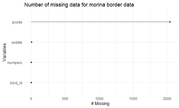
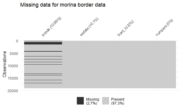
~ 10.6% of the observations have pcode missing and less than 0.1% (2 rows) where exdate (Date of crossing the border) is missing.
From the above visualization of missing data, we note that most records from the Morina border contain data for all variables, even the area of residence of the group crossing the border. One thing to note is that possible that large groups do not in fact belong to the same village/ municipality due to the difficulty of collecting and separating individual parties from the large group for data collection.
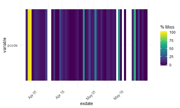
We can see that pcodes of records for crossing the border are largely missing for dates before March 31, 1999.
Two groups the UN High Comission for Refugees (uncnt) and Government of Albania’s Emergency Management Group (emgcnt) reported the daily number of people crossing the border. The data is recorded from March 24,1999 to May 25, 1999 in this dataset, out of which 29% of the data missing. Column uncnt has more missing values (50.6%). It appears that UN reported border counts where not captured when Emg started reporting those figures.
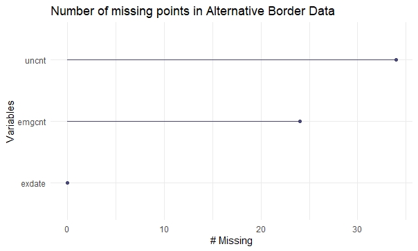
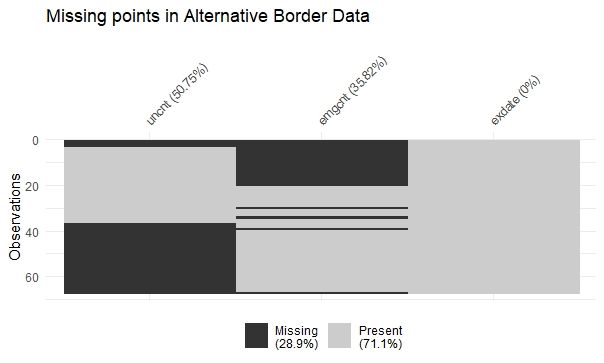
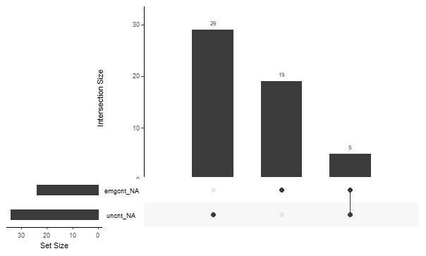
There are only 5 dates where the border crossings are missing for both groups (UNHCR and EMG).
Only around 1% of the data out of 1837 Kosovar Albanian families sampled for the survey is missing.
For the interview data captured for 265 Kosovar Albanian households in camps in Albania and Bosnia, pcode is null where pcode = -1.
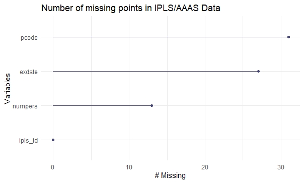
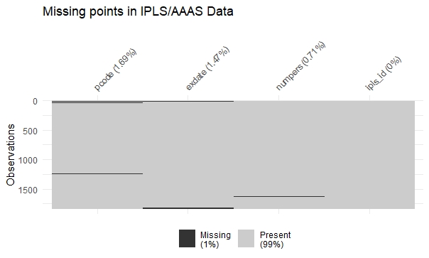
Out of 264 housholds in camps in Albania and Bosnia interviewed by IPLS/AAAS teams, around 7% of data is missing.
Columns exdate (Date crossing the border), pcode (Code of the village or town where they lived in Kosovo), lvdate (Date this household left their homes) have ~11.5% missing values. Column ngrp (Number of people in the group) and bos (Albania or Bosnia) have no missing values.
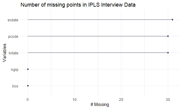
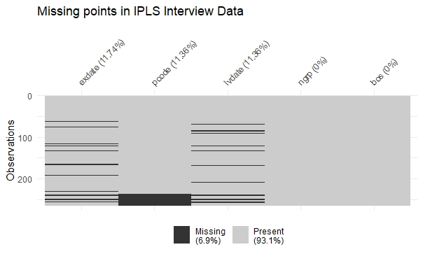
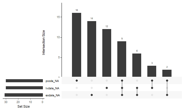
Next, we consider IPLS survey data, which has border crossing information for 671 households that crossed into Albania and 509 more that crossed into Macedonia. The IPLS survey data, ~23.5% of the 62 rows have some missing data. 11 rows have more than 2 missing values, and 9 rows are missing all of exdate, pcode and lvdate.
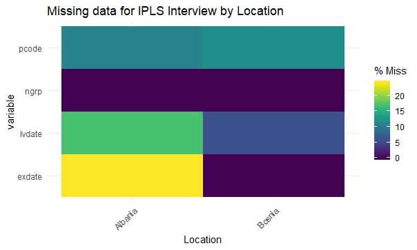
There seems to be a correlation in the missing data from lvdate and exdate and bos. bos = 0 ie we are missing lvdate and exdate for ~15-20% of people interviewed in Albania.
Next, we consider the PHR migration data. For ~100 data points (8.4%) out of 1180, the mcode (Code of the municipality where they lived in Kosovo) is missing. Here, only around 2.3% of the data missing, and there are very few rows where more than 1 column has a missing value,
There seems to be no one particular interview location (int_loc 1=Albania, 2=Macedonia) where a greater proportion of mcodes are missing.
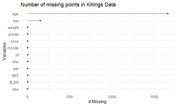
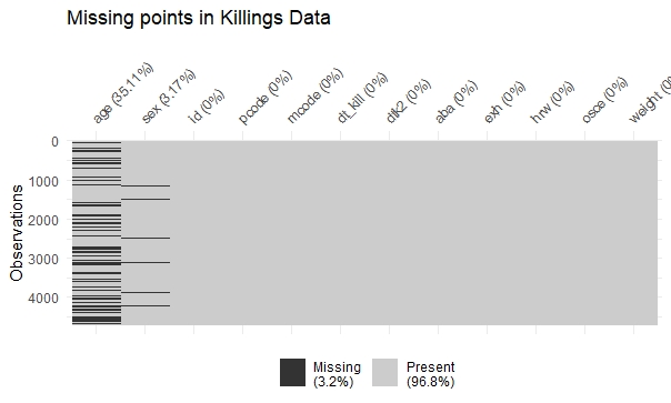
Finally, we look at missing values in the killings data.
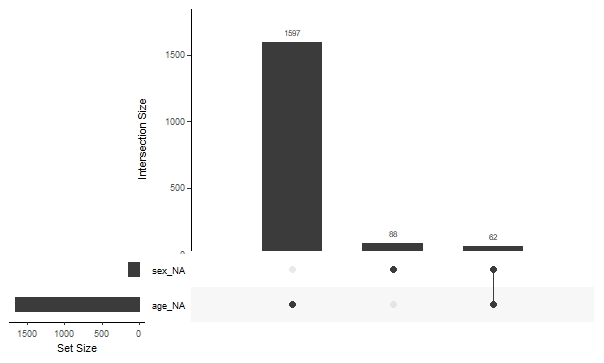
The age column has the most missing data (~35%). For ~3% of the data sex is recorded as unknown. From this figure we can see there are only 62 rows out of over 4k where both age and sex information is unknown.
There is no missing data on NATO airstrikes.
V. Results
i. Relationships between airstrikes, ground conflict, migrations, and deaths
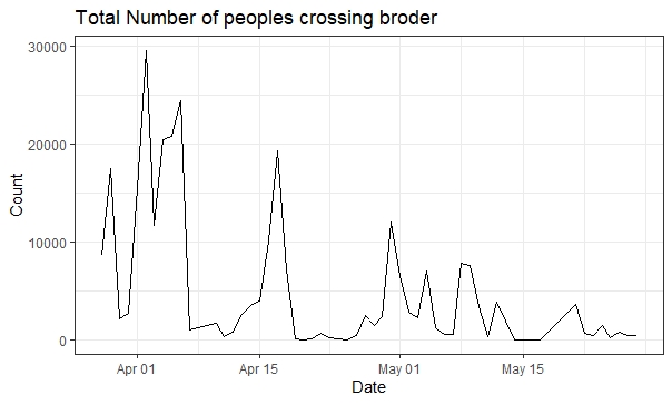
We begin by examining the patterns of migrations from the region over the period and its relationship to NATO airstrikes and KLA activity. This following chart shows the pattern distribution of people migrating via the Morina border over the time period in question.
We also visualize the migration counts reported by the UNHCR and EMG:
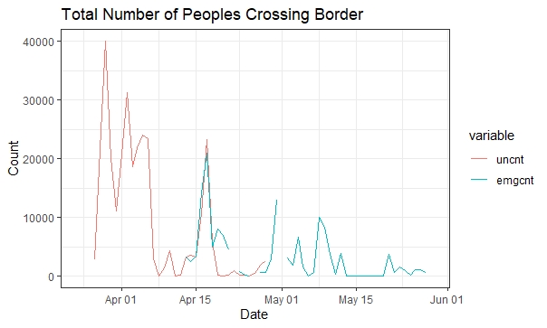
Since these counts appear to very similar distributions, we will refer primarily to the Morina border cross data when comparing agains other data to observe trends for convenience.
It clear that migration occurs in spikes over the course of the NATO airstrikes, rather than occurring smoothly or evenly. The first such spike occurs in the days immediately after the start of the NATO airstrikes on March 23. After slowing for two days, migration spikes again for several days after April 1.
Interestingly, large spikes in migration tend to follow significant NATO bombing events. A large spike on migrations occurs in early May after realtively low migration in the last third of April. This corresponds time when a NATO aircraft bombed an Albanian refugee convoy, killing 50 people, after mistaking it for a Yugoslav military convoy.
Another spike occurs just after May 7, when NATO forces completed another high profile attack on the Chinese embassy in Belgrade. Though no Kosovo Albanians were injured in the attack, the attack drew heavy press coverage an international scrutiny.
May saw yet another small spike in migration after the NATO airstrike on the Dubrava Prison in Kosovo from May 19 -21. This resulted in the Dubrava Prison massacre over the following days, where Yugoslav and Serb forces summarily executed at least 99 Kosovo Albanian prisoners in response to the bombings.
However, these events don’t fully explain the migration distribution we observe. To get more complete picture, we plot the count of NATO airstrikes occurring across days:
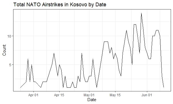
This chart reveals a surge in NATO airstrikes just before the surge in migrations around April 15. Again, this strongly suggests that NATO airstrikes may be directly linked to migrations.
To better understand the relationships between airstrikes and migrations, we can also compare the number of migrants from repsective municipalities to the municipalities subjected to airstrikes:
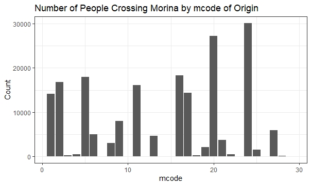
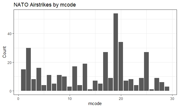
These charts clearly support the idea that airstrikes tend to correspond to increased migration from an area. We can see that mcodes 1, 2, 11, 13, 18, and 20 all reflect both elevated levels of airstrikes and of migrations at the Morina border. However, some mcode regions do not map especially well, for instance regions 17, 19, 24, and 25.
Next, we look at the relationship between these NATO airstrikes and deaths. The following two charts present the number of deaths by day and by mcode:
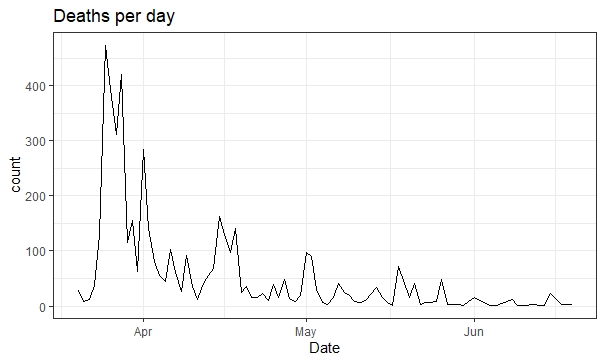
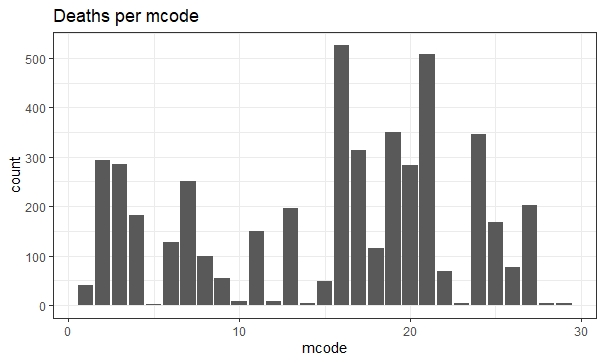
Interestingly, the number of deaths reported appears to be significantly lower during the later stages of the conflict in May and June. This is precisely when the level of NATO airstrikes was greatest, with over 5 airstrikes nearly ever day during this stretch. This suggests that a steady, high level of airstrikes might actually correspond to fewer deaths in the conflict, despite corresponding to increased migrations.
We can also see that there is a spike in the number of deaths in mid-April. This is aligned with a spike in the number of migrations at the same time, a phenomenon for which airstrike records suggest no explanation.
Finally, we visualize KLA activity to better understand whether ground conflict shows similar relationships to migrations and deaths. We limit our analysis to records of type ‘k’, casualties reported by Yugoslavian forces, as a proxy for the level of ground conflict.
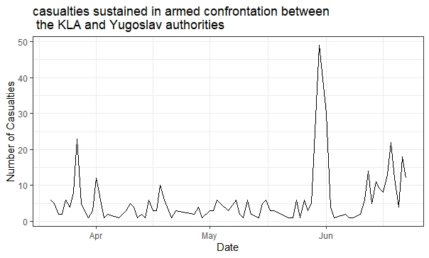
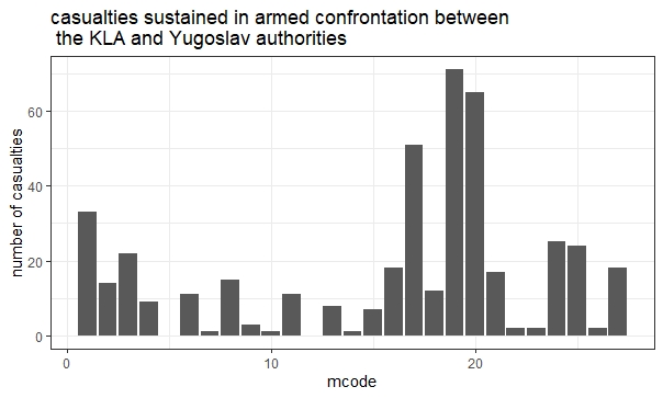
Most notably, we see a clear spike in KLA activity in mid-April. As the first such spike after the start of the NATO attacks in late March, it seems that this conflict might be tied to the corresponding spikes in migrations and deaths at the same time. Interestingly, the high levels of both KLA activity airstrikes at the end of May and in mid-late June don’t appear to correspond to any increase in migration or deaths.
ii. Other patterns
While the relationships detailed in section V.i above represent the most interest findings of our analysis, there are some other results from our exploration which are interesting to observe. These results relate to the distributions of migrants and the deceased on different variables and to differences in migration patters for refugees interviewed in different locations.
First, we observe the distribution of deaths among age, with breakdowns by sex:
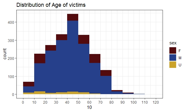
Most of the dead are men, a fact that that likely indicates women are less prone to participate in the armed conflict than men. More surprisingly, the mode of the distribution with respect to age appears to occur around 50, with the 40-50 and 50-60 age groups being most heavily represented. It is unclear why this might be, given that armies tend to be more populated by younger men. It indicates perhaps how all-consuming the conflict really was for individuals living in Kosovo, forced to participate even at even more advanced ages.
Next, we consider the refugee interview data collected by IPLS/AAAS. Some of this data was collected from refugees in Alabania (code 0) and some from refugees in Bosnia (code 1). Interestingly, it seems that the groups going to Albania tend to be larger.
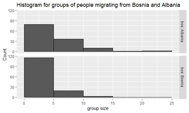
Since most migrants from Kosovo were ethnically Albanian, the majority of refugees tended to migrate towards to Albania. It is possible that refugees heading towards Bosnia may have tended to consist of core families with ties to Bosnia, and were thus smaller than the typically larger parties that grouped together on their trips to Albania.
We can observe a similar phenomenon in the PHR refugee interview data, which interviewed refugees in both Albania and Macedonia. Once again, parties in Albania tend to be larger. The 671 housholds interviewed in Albania had 73% more people who migrated (5905 people) than 509 households that crossed Macedonia (3395 people).
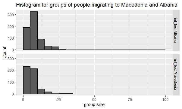
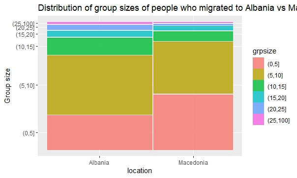
Here we see that more than ~48% of groups going to Albania migrated in groups of 5-10, and ~28% were in groups that were smaller than 5 members(~22% of the groups had group sizes >10). In contrast, groups migrating to Macedonia were evenly split between groups of size 0-5 and 5-10, and only ~12% of groups going to Macedonia at more than 10 people.
VI. Interactive component
This visualization is to explore the spatial distribution of migrations, killings, NATO Airstrikes and KLA clashes during March - June 1999, across different regions of Kosovo. Interactive D3 graph
We have calculated 4 different summary statistics per region, for each of 28 municipalities in the Kosovo region (the 29th region was missing longitude and latitude vaues), and the user can click on each dot to reveal the statistics corresponding to that region.
i. Instructions
The user can first choose a Terrain/ Watercolor Rendering. This is simply to provide different perspectives of the Kosovo region.
Then, the user can click on individual points and that will display the relevant data for that region under the Summary Statistics region. For instance, if you click on the dot at (Long 20.05, Lat 42.55), you will see that it is Municipality 2, it had 30115 Migrations during the specified time, etc.
Finally, the user can choose which criterion is used to scale the size of dots. For any given criterion, say Migrations, the size of dot of the ith region, corresponds to the relative value of that criterion, compared to other regions. So if you observe Municipality 24 (Long 20.5, Lat 42.57), and the Migrations criterion is selected, the size of its dot will be relatively larger than other dots, because the number of Migrants from this region was relatively higher than that of other regions.
ii. Analysis
Through this visualization, we can observe some big picture spatial trends for important statistics, namely Number of Migrations, Killings, NATO Airstrikes and KLA clashes.
The first observation one can make is that most of the affected population was concentrated between Long (20, 21) and Lat (42.4, 43), since the sizes of dotes outside this range are relatively much smaller, no matter which criterion you use. This could be because of strategic reasons, perhaps this sub-region was more central in political or military importance than others. However, it could simply be because this was more densely populated than the remaining regions. To further this analysis, population data can be collected, and relative statistics can be collected, such as migrations/ populations for a given municipality.
To narrow down on individual criterion, we see that the NATO Airstrikes were very selective in choosing municipalities, for example Muni 19 had 54 out of about 350 Air Strikes. This could be because KLA had the strongest level of presence in that region. And this is something that can be verified by looking at the KLA activity criterion, and noting that there were 75 (out of 525 total) reports of KLA activity in Muni 19. Similarly Municipalities 2, 17, 20 had high relative values of KLA activity as well as NATO air strikes. This gives some credence to the observation that NATO Air Strikes were strongly correlated with KLA efforts.
Moving on to killings and migrations, one would expect that there would be strong correlations between number of killings and migrations for a given region. However we note that this doesn’t come across from this visualization. For instance, Muni 20 had almost double the number of migrants compared to Muni 16, but about half the number of killings. This seems counter-intuitive, but suggests that there may have been many intra-region migrations as well, from one Municipality to another more peaceful one, for instance. And there would be no border record for these internal displacements. One potential next step for this analysis could be to investigate this internal displacement data, depending on whether municipalities were able to record them.
VII. Conclusion
In our analysis, brought life much of the data about the NATO war in Kosovo. It is important that we find ways for people to understand the complex effects NATO, KLA, and Yugoslav actions in this dark chapter of global history. Our analysis explores the consequences of different forms of military action, namely airstrikes and ground conflict, in terms of both refugee emigration and deaths. We find that despite the best intentions of the United States and its NATO allies, there is strong reason to suspect that airstrikes may led to much of the displacement of the residents of Kosovo to other countries. These relationships appear even more prominent than similar relationships for ground conflict. However, these airstrikes did appear to result in fewer deaths relative to ground conflict.
We also visualize the disparate consequences and migration patterns from this period. We find that surprisingly, many of the men who died in the war were older, aged 40-60. This illustrates how deep-rooted the sentiments and far-reaching the consequences of the conflict were. Moreover, refugees appear to exhibit very deliberate patterns in choosing where they will migrate. There appears to a significant distribution in the size of migrant groups going to ethnically similar Albania versus those going to Bosnia or Macedonia.
Finally, we put forth a power tool to let users interactively explore contours and consequences of the conflict. By letting people visualize the airstrikes, deaths, and emigration on a map of Kosovo, we let people more experience the seriousness of the war in a more tangible and immediate way. This kind of interactive visualization is powerful in teaching the lessons of ethnic conflict and building understanding to defer such conflicts in the future.
External Links
The links to data used in this analysis are aggregated at https://hrdag.org/kosovo-data/
The interactive visualization of data by municipality is available at Interactive D3 graph